A paraglider pilot today has no shortage of forecasts. Paraglidable computes a “fly” probability, Meteoblue draws a thermal diagram, a dozen sites show CAPE and cloud base. They all answer the question “fly or don’t fly” — and they all lie differently, because the question itself is badly posed.
Three years ago I ended the CanFlyBot article with an honest confession: I wanted a forecast server of my own, but the open-source project it all depended on had been dead for four years, the GFS data model had changed underneath it, and — a direct quote — “I am not a big Python fan. Maybe later.”
Later arrived. There is now a Flyability layer on maps.flybeeper.com: a machine-learned forecast of how far people will fly in a given area on a given day. The model is open — paraglideml on GitHub, MIT, trains and infers out of the box. And as for not being a Python fan: this model is written in Python, and it is the best Python I have written.
This is the story of how it is built inside: where the five million flights come from, why the target is a distance and not a binary label, how to fight the lying in self-reported logs, why three boosted trees need isotonic calibration, and why evaluating a model properly takes longer than training it.
Three numbers instead of yes/no
Start with the decision that shaped everything else.
A binary “flyable day” label is bad by construction. If “flyable” means “at least one flight in the cell that day”, then a 200 km classic and a fifteen-minute sled ride to the landing both count as a one. In our data, roughly a third of “flyable” cell-days are local flights under 30 km. Any classifier trained on that label hits a ceiling set not by its architecture but by the noise in the target variable.
So the model answers not “whether” but “how far”. For every grid cell and every day it emits three probabilities:
| Tier | Threshold | Meaning | Output |
|---|---|---|---|
| flyable | XC ≥ 15 km | a day worth driving out for | P(≥ flyable) |
| good | XC ≥ 50 km | a proper XC day | P(≥ good) ← headline |
| epic | XC ≥ 100 km | a day you retell in winter | P(≥ epic) |
The tiers are cumulative: a day with a 100 km flight is automatically “good”
and “flyable” too. The model is required to maintain
P(≥flyable) ≥ P(≥good) ≥ P(≥epic) — and the construction guarantees it,
more on that below.
Why 15/50/100 exactly? They are empirically stable thresholds of “entry ticket”, “good day” and “big day” for a mid-level pilot in the mountains. To be honest: the thresholds could be anything, the cumulative construction does not care. 15/50/100 are easy to say out loud and easy to check against logs.
Base rates in the training data: flyable 48 %, good 29 %, epic 16 %. An epic day in the Alps is roughly every sixth summer day — and the hardest to predict: fewer positive examples, higher price of a calibration error.
The data: five million flights
The source of truth for “how far people actually fly” is the record of flights. I use XContest: a world export covering 2006–2026, 5,037,715 flights. Two caveats right away, both honest.
The first: these are not flight tracks. The export is a basic record that a flight happened — start time, takeoff coordinates, duration, and the distance of the declared route. No GPS snakes, no points in space — and our task does not need them: XContest has already answered “how far” by computing the distance of every route.
The second: I did not collect the data — the world export was provided by a friend.
The export is dirty, as any database of five million self-reports is. Exact duplicates (pilot + start time + distance) are about 0.25 % of rows. Distances run from zero to a world-record… no, not a record: a plainly impossible 25,511 km. Ground speeds from negative to supersonic. A deterministic cleaner throws all of that out; filtering by “XC quality” stays with the calling code.
The world export has two properties the per-country extracts — which is where this project started — did not have. First, coordinates for every flight, not one point per launch site: 3.5 million unique pairs across 6,874 sites, median spread within a launch 0.23 km. That is more than enough to bind a flight to a grid cell. Second, the whole year round. The season is not the habitual May–September but March 1 to October 31, because the data spoke for itself: in Alpine cells April produces more flights of 50 km and longer than July (47,340 against 41,793), and March beats September. Spring stability is worth more than summer heat. I would not have guessed that — you can only measure it.
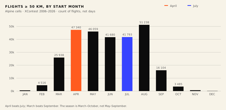 Flights ≥ 50 km by start month, Alpine cells, XContest 2006–2026. April over
July; March over September.
Flights ≥ 50 km by start month, Alpine cells, XContest 2006–2026. April over
July; March over September.
The daily anchor — 06/12/18 UTC — is Alpine, aligned with the GFS race. Outside Europe it is wrong: median start time in UTC is 11 a.m. in the Alps, 5 in India, 1 a.m. in Japan and Australia, 15–17 in Colombia and Mexico. Extending the model to other continents will mean recomputing to local solar time. Call it a head start, not an omission.
The grid: why 0.75° × 1°
The model works in cells. The natural candidate is the GFS degree grid, 1° × 1°. But a degree cell is not a square: a degree of latitude is the same everywhere, a degree of longitude shrinks with the cosine of latitude. At Alpine latitudes a 1° × 1° cell is 111 km tall and 76 km wide — on the map it stands 1.45× taller than it is wide. When we first drew that layer, it looked like badly stretched tiling.
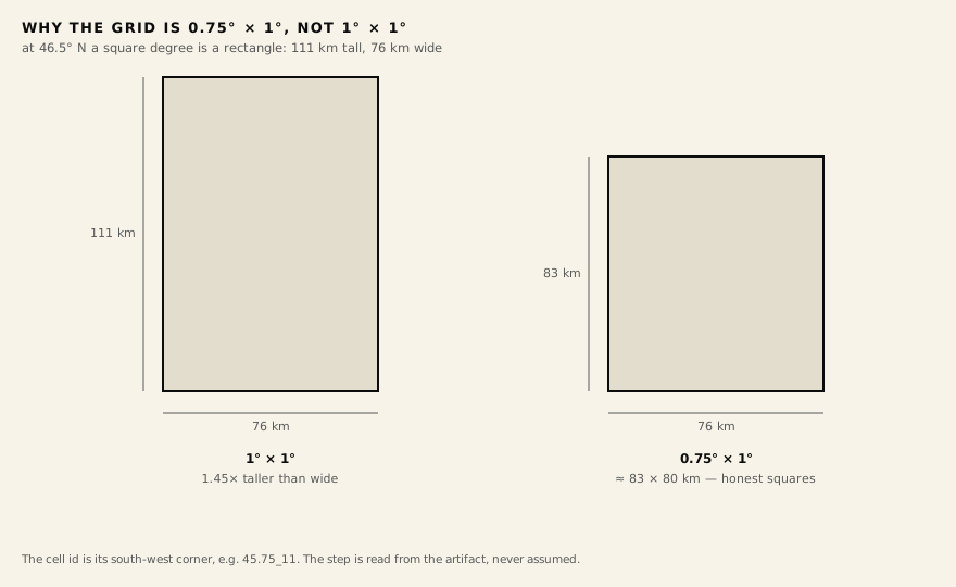 One square degree versus the 0.75° × 1° cell, to scale, at 46.5° N.
Hence the 0.75° latitude step: a cell of 0.75° × 1° is roughly 83 × 80 km —
nearly square at Alpine latitudes. The step is not hard-coded; it is read
from the artifact (cell_lat_degrees / cell_lon_degrees), and the cell id
is its south-west corner: 45.75_11.
The cell size is not an accident — it is part of the answer to “what can be predicted at all”. Eighty kilometres is the scale of a synoptic situation, and that is exactly the scale that survives a multi-day forecast. Point convection over one particular ridge is unpredictable at three days’ lead time in principle, and an honest model should not pretend otherwise.
There were 752 candidate cells. The filter is accumulated flight history:
enough days flown, sites, pilots. 174 cells passed — the Alpine arc from
Slovenia to France, plus Spain, the Balkans and Turkey where the history is
rich enough. Across the candidates: 957,185 flights, 146,266 pilots, 17,358
launch sites. The most saturated cell is 45.75_11 (Veneto–Dolomites):
60,849 flights, 303 launches, 7,830 pilots. The final training set is 227,070
cell-days over six seasons, from 22 March 2021 to 9 June 2026.
Outside the coverage the map says “no data for this point” — a deliberate formula: it means “not modelled here”, not “bad day”.
The weather: GFS and its underworld
The model’s input is GFS at 0.25°: Global Analysis archives
(gfsanl_3_*.grb2, the f000 field), 135+ parameters per cell cached as NPZ.
Features are derived from the vertical profile; the pipeline never downloads a
full GRIB file — only the byte ranges of the fields it needs, over HTTP Range.
The main GFS trap in the mountains is terrain. At 0.25° the Alps are smeared: the atmospheric model simply does not see the peaks. Kobala (1,080 m) is, to GFS, a surface near 1005 hPa — about 100 metres above sea level. Marmolada (3,343 m) is near 910 hPa, about 1,000 metres. The same “at the ground” quantity in neighbouring cells refers to different altitudes.
The fix is not to fight the terrain but to hand the model an anchor. Surface
pressure sp_0sfc tells it where the real ground is; every other feature is
computed as a profile from 1000 to 500 hPa, and the model learns to relate the
profile to the true altitude by itself. An amusing corollary: GFS provides
extrapolated (non-zero) temperature and wind at levels below its own
surface — for Marmolada that is 1000–925 hPa, “underground” floors with valid
data. Instead of discarding them as meaningless, we feed the model the whole
profile plus the anchor — and it finds shear and inversions at any altitude,
generalising from plains to high Alps.
The terrain features of a cell do not come from a digital elevation model
either, but from real FlyBeeper launches: elevation is the median launch
altitude of the cell (real takeoff heights, not the cell mean that smears the
Alps into valleys), mountainess is the altitude spread (p90 − p10)/1000 as
a relief proxy.
Labels: trust, but weigh
The next problem: flight logs are self-reports, and they lie unevenly. On a day when the whole of northern Italy was flying, a cell with zero flights is a confident “didn’t fly”. On a day buried in fog where one fanatic still dragged 60 km along a ridge, the cell is formally “good” — though the day was awful and nobody could have repeated that flight.
Training therefore uses not hard labels but confidence weights — confident learning in its applied form:
- Confident good (weight 1.0): the cell cleared the distance threshold and the region as a whole was flying — at least five cells reached “good” that day. A real synoptic day, not a one-off anomaly.
- Confident bad (weight 1.0): zero flights in the cell and a quiet region — a confidently dead day.
- Ambiguous cases — local flying in a live region, or one lucky cell in a dead region — get a reduced weight. The model learns from the clear cases, not from a coin toss.
The regional context (“how many cells of the region were good that day”) makes the signal synoptic — and that is the quality which later survives the move from analysis to a three-day forecast.
Fifty-two features
The production model (experiment exp_056) uses 52 features. All weather
features derive from the vertical profile, so they generalise across terrain
elevation:
- Surface context:
sp_0sfc(the ground anchor), 2 m temperature and dew-point spread, 10 m wind components and gusts, total cloud cover, visibility. - Instability and moisture: CAPE, CIN, dew-point spread at 850 and 700 hPa — cloud base and dryness aloft.
- Vertical velocity (omega): at 850/700/600/500 hPa plus low-level aggregates. Subsidence kills a day more reliably than a lack of CAPE.
- The 1000→500 hPa profile: wind speed at 11 levels and temperature gradients
over 10 layers — so the model finds shear and inversions at any altitude,
not wherever the author thought to put a feature; low-level shear
wind_shear_low = |V850 − V10m|. - Daily aggregates: max CAPE of the day, max wind at 850/700, max gust, diurnal CAPE amplitude — the day’s profile folded into the flying window.
- Terrain: elevation and mountainess from real launches.
And one honest story about a feature I had to remove. I built a physically
pretty slope_wind_alignment: per cell, eight launch orientations from real
data, scored against the forecast wind — “is it blowing onto the working
slopes”. It did not last: testing showed the feature added noise, not signal.
GFS wind direction is too inaccurate at this resolution, and mountain launches
are sheltered by terrain behind them, so a “bad” direction often does not
interfere. The feature is gone; the orientation machinery stays in the code
for the future. A negative result is still a result — I invested more belief
in that one than it deserved.
The model: three boostings and a calibrator
Now for what is under the hood. Spoiler: not a neural network.
The project’s history is 65 experiments, exp_001 through exp_065. The
first era was a binary “flyable” classifier per cell. It quickly hit the label
noise described above: per-cell F1 ranged from 0.46 in the Apennines to 0.96
in the Alps — a model that works where data is plentiful and guesses where it
is not. The second era was a PyTorch MultiRegional network with regional
embeddings and attention: a shared backbone for all regions, regional
adapters on top, confidence weights in the loss. A beautiful architecture,
honestly documented in
multiregional.md.
The third era began with a question: is the task even right? Changing the target — from a binary label to distance — changed everything. On cumulative tiers, an ensemble of three ordinary scikit-learn gradient boostings wins consistently:
for tier in (flyable, good, epic):
    clf = HistGradientBoostingClassifier(
        learning_rate=0.05, max_iter=400,
        max_leaf_nodes=31, l2_regularization=1.0,
    )                                   # fit with confidence weights
    iso = IsotonicRegression(out_of_bounds="clip")
                                        # calibrate on the latest year as holdout
# and a monotone clamp on the way out: P(>=flyable) >= P(>=good) >= P(>=epic)
A neural network measures training in epochs — passes over the data. For a
boosting, an epoch is one iteration: add a tree, correct the residual error.
Here is the real learning curve of the good-tier model, taken from the
production artifact exp_056 — not a retrospective re-run but the history
scikit-learn stores inside the trained model:
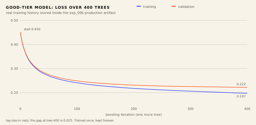 The good-tier learning curve: loss on training (blue) and validation (orange)
over boosting iterations.
The good-tier learning curve: loss on training (blue) and validation (orange)
over boosting iterations.
Validation loss falls from 0.450 to 0.222 and levels out around iteration 400; the gap to training is 0.025. Ripe, not burnt: trained on weighted clear examples, the curve is smooth and drama-free, and 400 trees turn out to be exactly how many are needed.
Why a boosting and not a network is pragmatics, and it has three parts:
- Calibration is worth more than the last hundredth of AUC. The product shows the user “56 %”. That number must mean 56 % — not “somewhere between 40 and 70”. Isotonic calibration on a fresh year, fitted on top of a boosting, delivers that property cheaply and reliably.
- Inference without PyTorch. The model rides inside the package itself:
pip install— and it predicts. No gigabytes of dependencies on the pipeline server. - Trees need no feature normalisation and are indifferent to pascals, kelvins and metres per second sharing one vector.
The neural network was not thrown out — MultiRegional stays in the repository
as living history (the paraglideml train model command), and the comparison
of eras is part of the documentation. The product is three boostings.
The monotone clamp deserves a word of its own. Three independent classifiers
do not guarantee ordered probabilities: sometimes P(≥good) accidentally
exceeds P(≥flyable). After calibration, each cell-day is clamped so the
invariant always holds. In exp_056 the clamp touched 11.3 % of cell-days —
a small but mandatory layer of hygiene: a user must never see the probability
of a 100 km route higher than that of a 15 km one.
How well it works: the honest protocol
Here begins the most important part of any ML story — and usually the shortest one in the slides. Ours is the opposite.
A reference card, so you don’t have to google mid-read. Five measures of quality appear below; one line each.
The four outcomes. If “good day” is the model’s decision at some probability threshold, a day ends in one of four boxes: a good day called good — true positive (TP); a good day slept through — false negative (FN); a bad day called good — false positive (FP); a bad day called bad — true negative (TN). Precision is the share of the right among those called good; recall is the share of caught among all the good. Raise one, the other falls — hence the aggregates below.
AP (Average Precision) is the area under the precision–recall curve: ranking quality averaged over every threshold at once. Compare it not to 100 % but to the base rate — the share of good days in the data (0.29 for good). AP 0.72 means the ranking is two and a half times more useful than guessing.
ROC-AUC is the probability that a random good day gets a higher score from the model than a random bad one. 0.5 is a coin toss, 1.0 is perfect separation.
Brier is the mean squared error of the probability, (P − outcome)². It is about calibration: “is 60 % really 60 %”. Closer to zero, more honest the numbers.
Spearman is rank correlation: whether the model’s order of days matches the order of actually flown distances, even when absolute values drift.
In-sample metrics — trained and scored on overlapping data — for the good tier: AP 0.91, ROC-AUC 0.97. Those numbers are lies, and I quote them only to show the gap. The honest protocols are three.
First: a rolling-origin backtest. Train only on past years, sit the exam on the next one: fit on 2021–2023, score 2024; fit on 2021–2024, score 2025. That measures the ability to predict the future rather than memorise the past. For the good tier: AP ≈ 0.72, ROC-AUC ≈ 0.89. The fall from 0.91 to 0.72 is the price of honesty, and it is better known in advance.
| Evaluation | good tier |
|---|---|
| In-sample (optimistic, no holdout) | AP 0.91 / ROC 0.97 |
| Rolling-origin backtest | AP 0.72 / ROC 0.89 |
| Held-out 2026 season, Spearman vs actual distance | ≈ 0.92 |
| +1-day forecast instead of analysis | AP 0.81 / ROC 0.93 |
| +3-day forecast | AP 0.73 / ROC 0.90 |
Second: a sealed season. The 2026 season was never seen in training; on it, the ranking of P(≥good) correlates with the actual best distance of the day at Spearman ≈ 0.92. Ranking is what holds up best: absolute probabilities drift, the order of days does not.
Third, the sneakiest one: forecast skew. The model was trained on GFS
analysis — the f000 field, “what actually happened”. In production it eats
forecasts at +1 to +3 days lead time, and a forecast has an error of its
own. The distance between the two regimes is measured by a dedicated command
(paraglideml forecast-skew) on the same cell-days: at +1 day the good tier
holds AP 0.81 / ROC 0.93; at +3 days, AP 0.73 / ROC 0.90.
Putting the three together gives the product conclusion: a three-day horizon, with +1 day as the confident headline. The ranking survives to +3 days because the target is synoptic — the potential of an ~80 km cell, not a point thermal over a ridge. We separately evaluated a “forecast-aware rebuild” — retraining with simulated forecast noise — and rejected it: recalibration is monotone, it fixes Brier but cannot change the ranking; the ROI was judged poor. Another decision that is easier to make once it is measured.
From notebook to production
Everything above would be worth little if it lived in a notebook. It lives here:
GFS cycle (00/06/12/18 UTC)
  → byte-range field download
  → paraglideml: 52 features → 3 calibrated GBMs
  → GeoJSON of cell rectangles
  → R2 object storage
  → Cloudflare Worker (api2.flybeeper.com/flyability/*)
  → MapLibre layer on maps.flybeeper.com
A systemd timer runs the pipeline four times a day — after every GFS cycle, roughly six hours behind it; every run re-forecasts today as well as the three days ahead. One orchestrator produces three artifacts in a single pass: flyability, a 0.25° storm grid and aerological soundings; the flyability model is a pure consumer of GFS, all the other weather logic lives next to it, not inside it.
The worker serves two kinds of objects: index.json with a 10-minute edge
cache, and immutable snapshots /flyability/{YYYYMMDD}/forecast.json cached
for a day. The frontend re-reads the index every six hours, on returning to
the tab, and at local midnight — the day labels are relative (“today”, “+1”),
and yesterday’s “today” must die on time. If the source goes quiet for more
than 30 hours, the map shows an honest “data is stale” banner. If the layer
fails to load at all, it switches itself off with a message instead of
remaining a dark rectangle of silence.
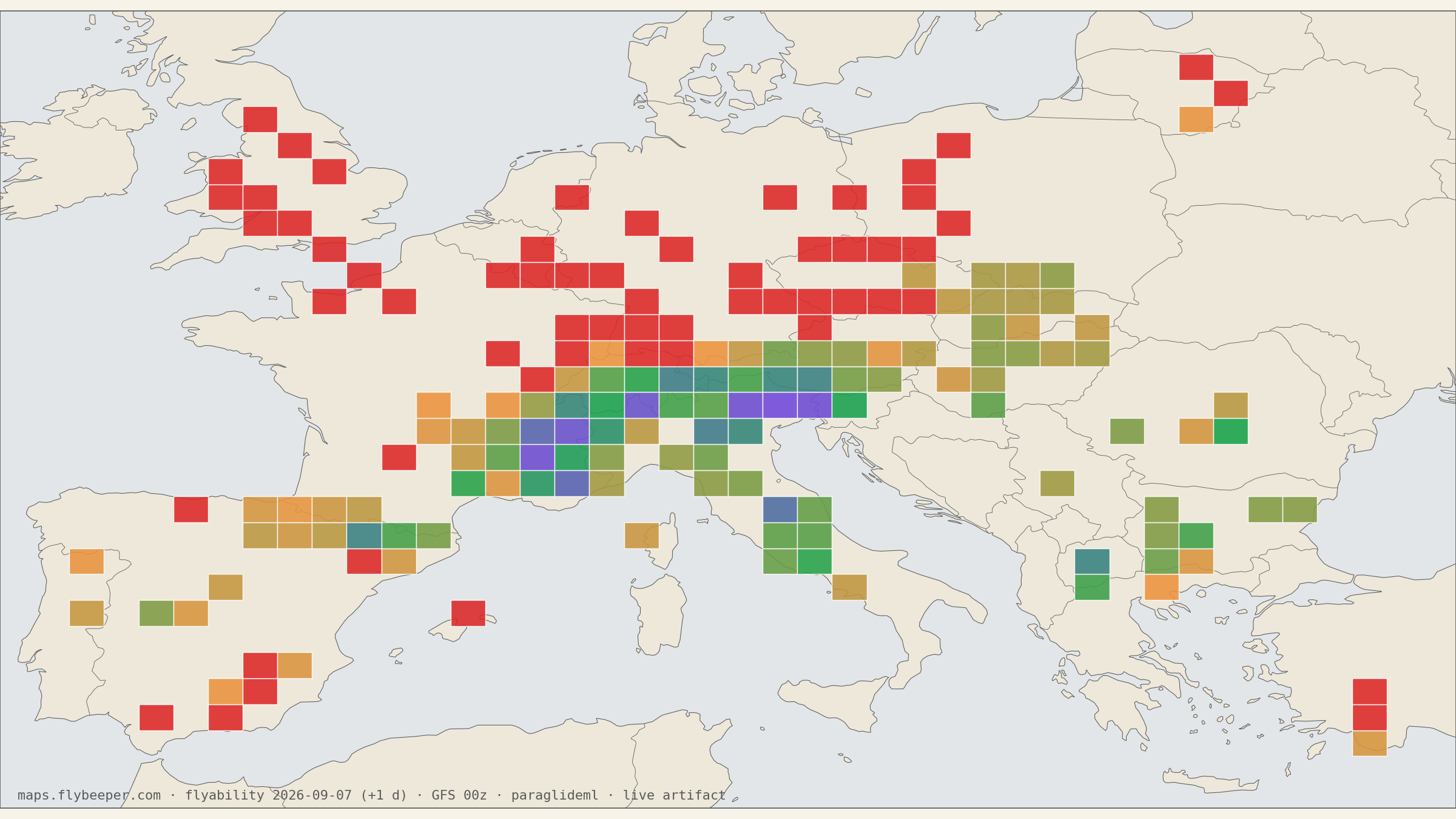
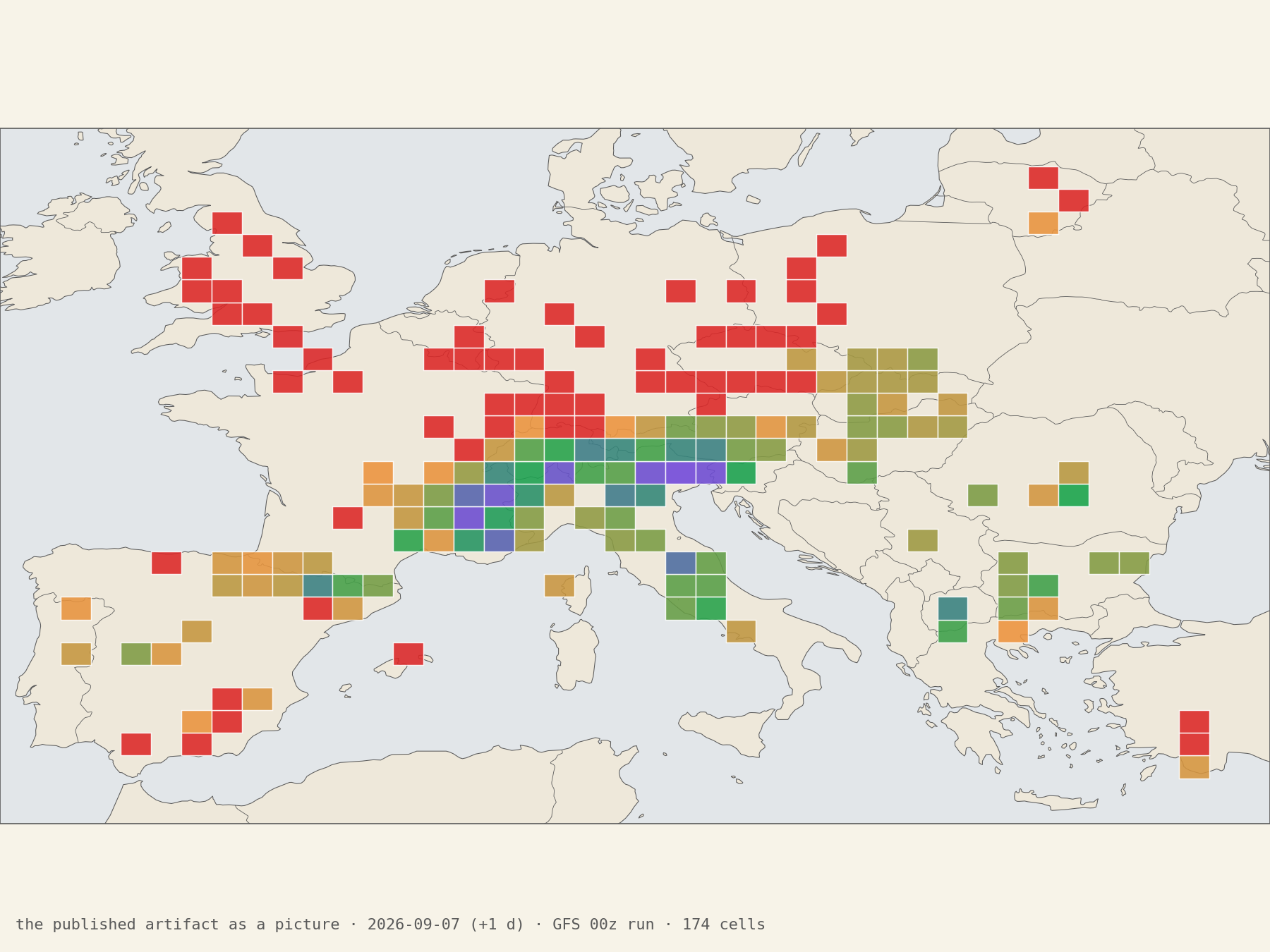 The published artifact as a picture — the live layer draws the same
rectangles, in the same colours, with day chips and a date navigator. Real
run, 174 cells, +1-day lead.
The published artifact as a picture — the live layer draws the same
rectangles, in the same colours, with day chips and a date navigator. Real
run, 174 cells, +1-day lead.
What the user sees. Four day chips: today and three ahead. Every cell is coloured by the sum of the three probabilities, from orange through green to purple. One hard rule apart: if the chance of even a 15 km flight drops below 20 %, the cell goes red regardless of everything else — red is the stronger statement, and its threshold is its own. The card shows a days × tiers table with gradient cells, a word verdict (“not flyable / weak / good / epic”) and storm rows: thunderstorm risk ⚡, precipitation 💧, cloud cover ☁.
And one detail I am fond of: the cells are drawn honestly. They are large ~80 km rectangles, and the app says so in small print: “forecast per ~80 km cell, not pointwise”. The model knows nothing about the valley breeze, the working face or the foehn gap; it has no right to claim point accuracy, and it does not.
What the model does not know
Limitations are not an appendix — they are half the trust in a forecast.
- Nothing inside a cell. A valley floor and a 2,500 m ridge in the same rectangle get one number. Valley wind, the working face, local convergence — that is what stations and soundings are for, not this model.
- Nothing about the time of day. A day is one number; the model does not tell morning from evening inside it.
- Nothing about you. The probabilities answer “someone flying here that day gets that far” — not “you will”. Your wing, your hours and your mood are not in the model, and no app setting changes the numbers.
- Red is more reliable than green. The absence of conditions is easier to predict than their presence.
Try it
All the code is open: github.com/Genajoin/paraglideml, MIT licence. The trained model ships inside the package; inference needs no PyTorch:
pip install 'paraglideml[inference] @ git+https://github.com/Genajoin/[email protected]'from paraglideml import predict_tiers
rows = predict_tiers("2026-06-15") # downloads the GFS slice, scores every cell
# → [{'cell': '46.50_13', 'p_flyable': 1.0, 'p_good': 0.56, 'p_epic': 0.33}, ...]For your own region it is the same road we walked here: export the flights,
fetch the GFS archive, four paraglideml data ... commands, one
paraglideml train ordinal. The data downloaders live in the related
PyParaglide project.
And if you would rather not train anything but look at the forecast for the Alps the model already knows — the link below opens the map centred on the model’s whole coverage, from Spain to Turkey, with the Flyability layer already on; the day chips switch today/+1/+2/+3.
Further reading
- paraglideml — the code;
docs/MODEL.mdis the full feature and metric documentation;docs/multiregional.mdis the history of the neural era. - Machine Learning for Thermal-Soaring Optimisation — our survey of ML approaches to thermalling: the neighbouring problem, on a different prediction horizon.
- CanFlyBot — the bot this story started from, whose roadmap this article closes.
- Data: XContest, GFS.